
Day Trip Planning on Wanderlog
Wanderlog is an all-in-one travel planning app and website that helps users organize itineraries, bookings, and notes in one place.
Motivation Behind Redesigning Wanderlog
As an avid travel enthusiast, I’ve used Wanderlog religiously ever since I discovered it two years ago. For my passion project, I reflected on my own personal experiences and did secondary research on the potential pain points of using Wanderlog. When I was in Japan, I remembered noticing that there were no visual cues, separate modules, or specific input types for adding day trips (e.g., from Osaka to Himeji), which made my daily last minute planning more inefficient and clunky. Through doing secondary research on user feedback and reviews, I noticed that some of them shared the same sentiment as me. Hence, my idea for this project materialized into an end-to-end UX design case study.
Timeline:
Dec 2025
Tools:
Figma, Zoom
Role:
UX/UI Designer, UX Researcher
Problem Statement
The app lacks an efficient way to integrate specific elements like day trips and tours across multiple cities or countries within a single, continuous trip.
"How might we integrate multiple day trips within a single travel itinerary into the existing Wanderlog platform to enhance intuitive and efficient planning?"
Solution
My proposed solution is that Wanderlog unifies the day trip planning flow into one platform, giving travellers the ease and necessary flexibility to create and edit without complicating the core itinerary.
Competitive Analysis
I analyzed three competitors along with Wanderlog to identify their strengths and weaknesses associated with key features.

Persona
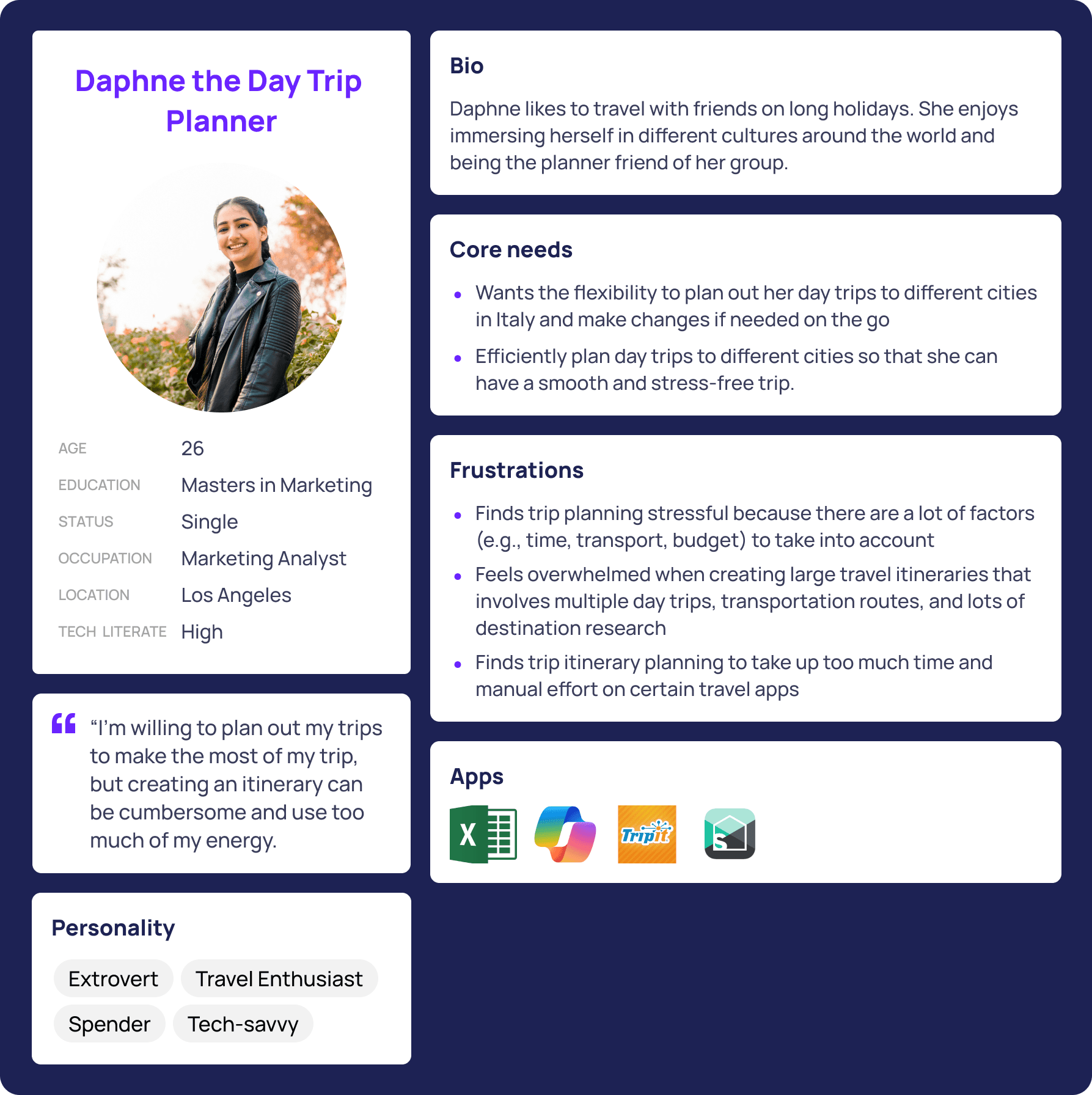
To build empathy with users, I created a persona called Daphne to guide my focus and identify opportunities to improve her travel planning experience.
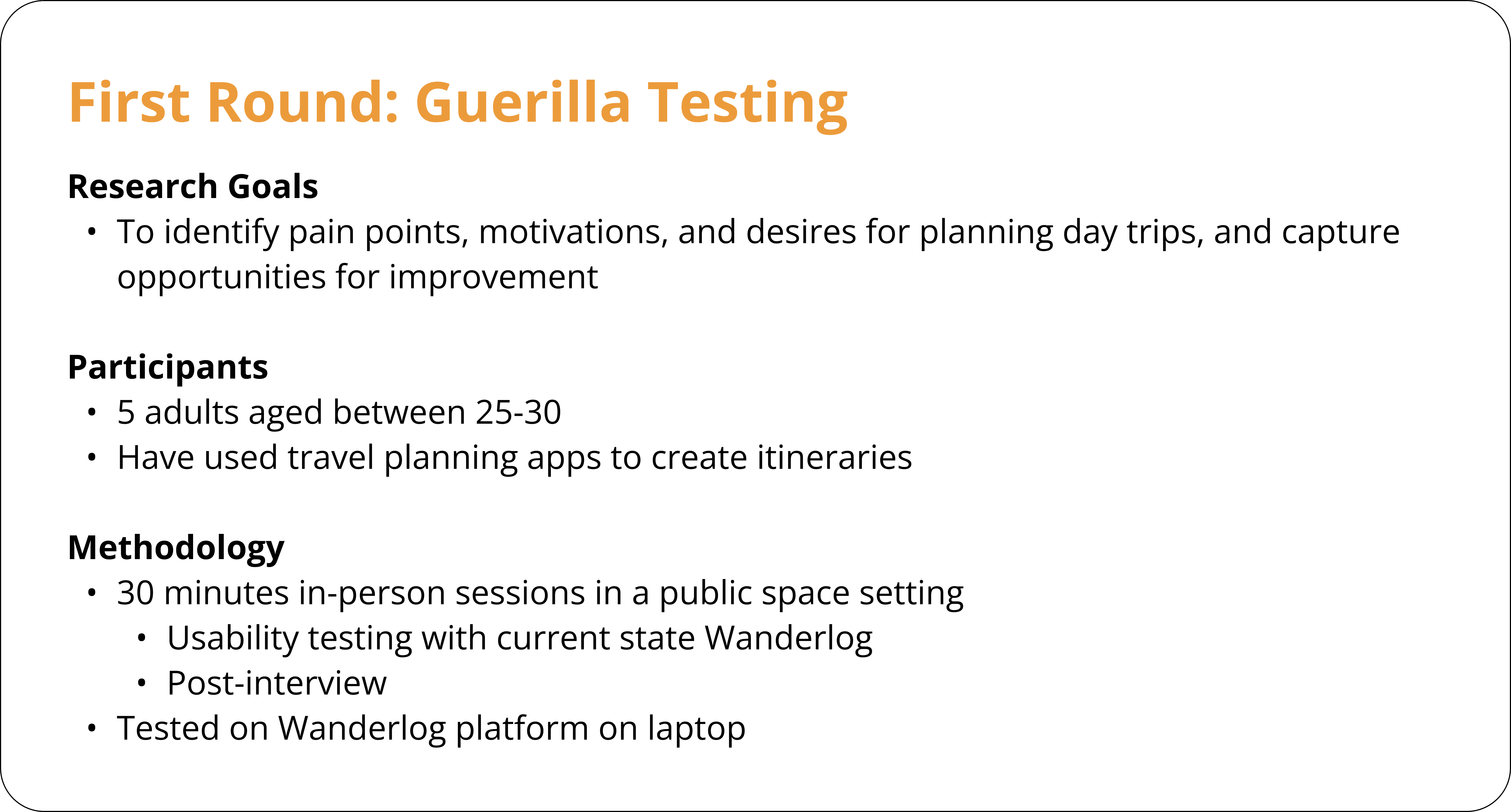
Research Methodology: Usability Testing
My key findings were categorized into 3 main insights:
2/5 participants stated that the homepage was cluttered. They suggested having separate modules to input day trips vs. weekly trips.
3/5 participants shared that they would like to sync the tours through Wanderlog or add the QR code from the external ticket source.
2/5 participants described experiencing a lack of confidence using Wanderlog where they need time to initially explore the tool and get used to it before creating an itinerary.
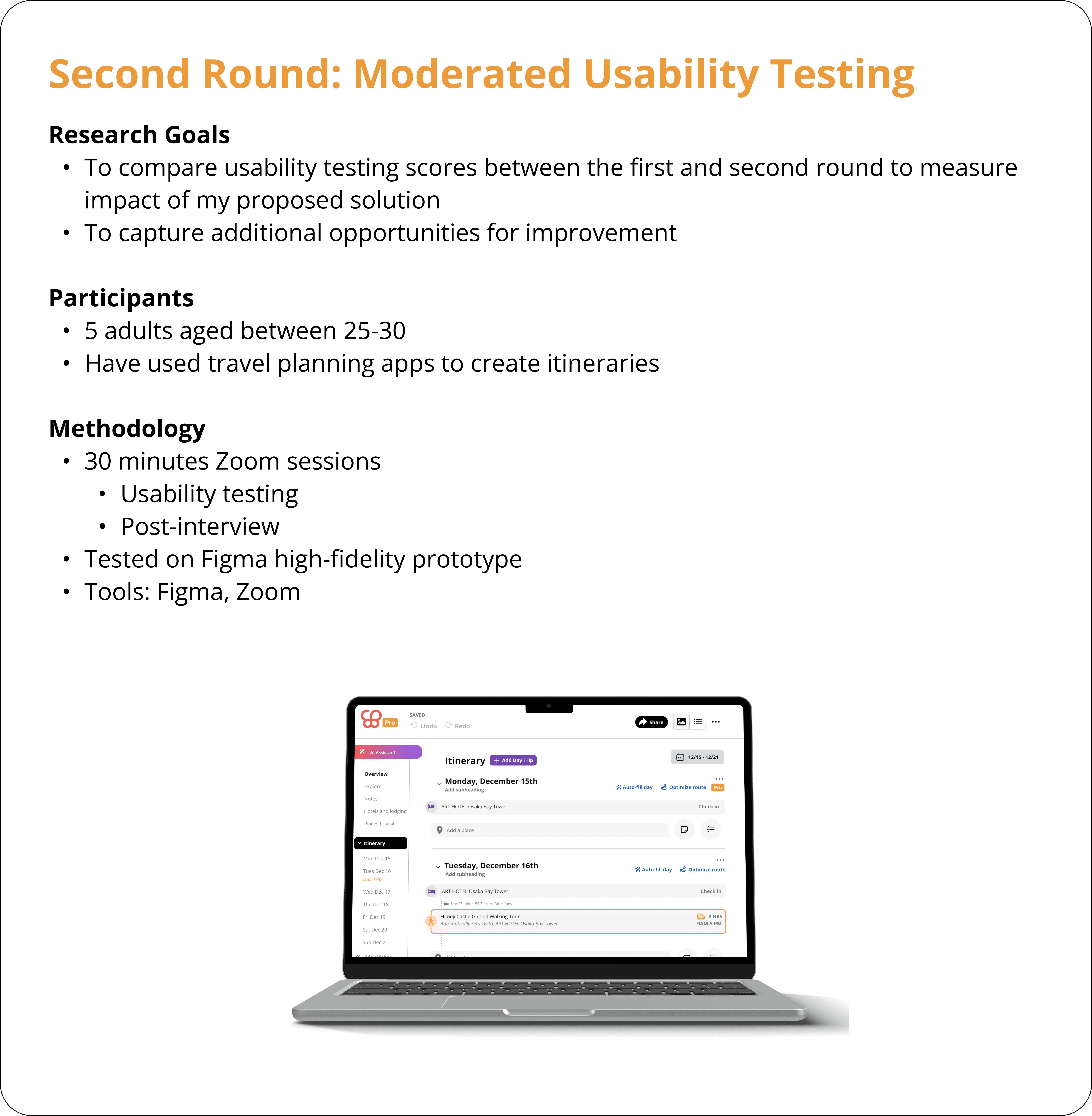
Comparative Analysis of Usability Test Scores
I compared the following pre- and post-solution usability test scores between the two rounds:
Average System Usability Scale Score (SUS)
Average Customer Satisfaction Score (CSAT)
Average Net Promoter Score (NPS)
I chose these three specific metrics because I wanted to capture a holistic, 360-degree view of the user experience. By combining these three, I have triangulated usability, immediate satisfaction, and long-term loyalty. Can users successfully plan a trip without getting frustrated? How do users feel about the specific changes we just made? Is the redesigned website good enough to make users advocate for us? By utilizing these metrics, I can answer these questions to ensure that my redesign didn't just make the website look better, but made it more functional, more satisfying, and more valuable to the user base.

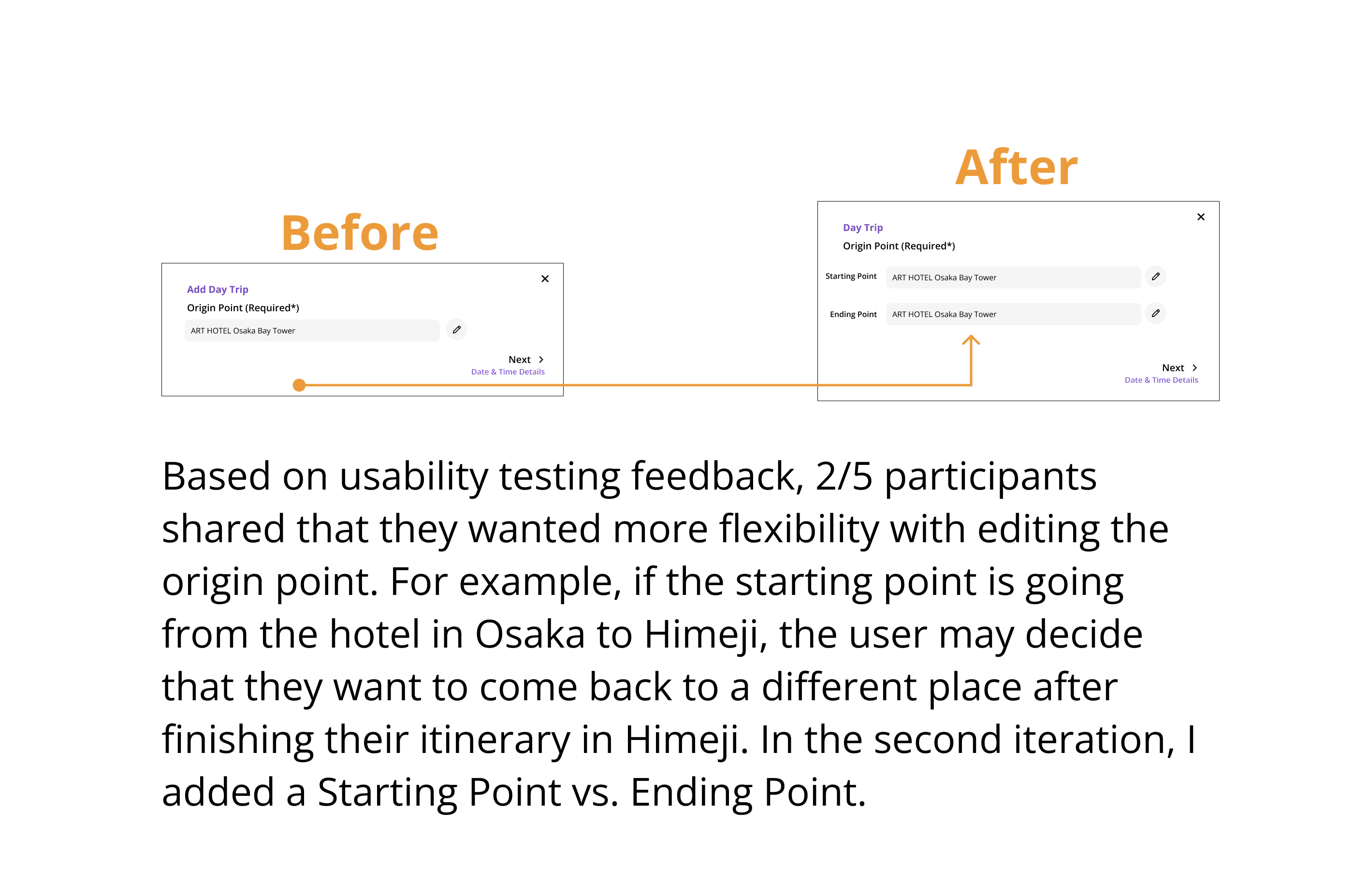
Before vs. After
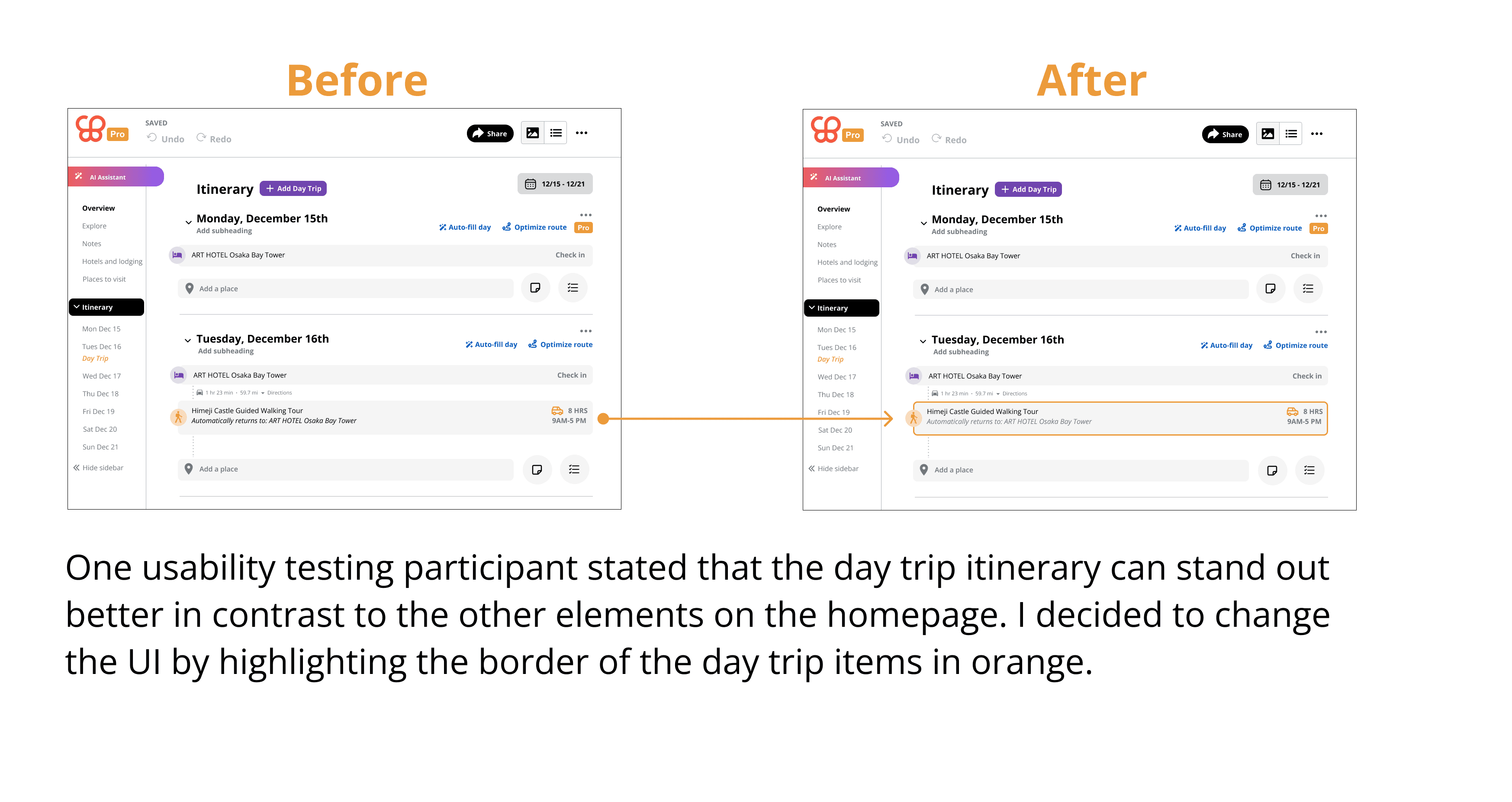
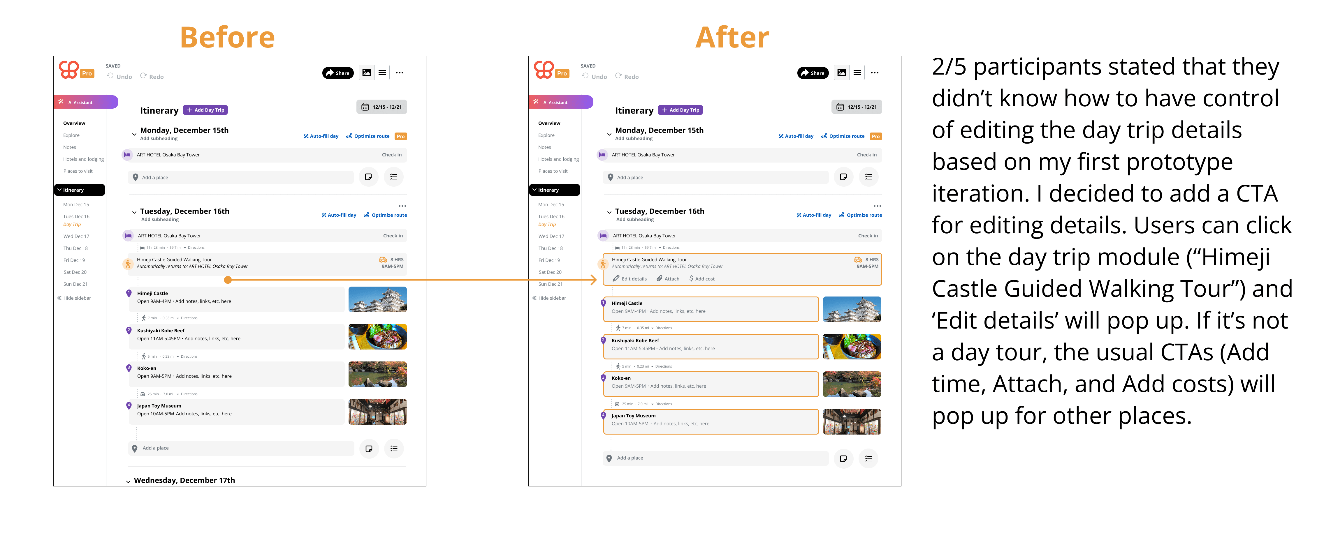
Here is a comparison between the first iteration and second iteration of the redesign:
Final High-Fidelity Prototype
Lessons Learned
Respecting Core UI Philosophy
Wanderlog’s design system already manages a massive amount of data on a single screen: dates, times, notes, reservations, and costs. This presents a challenge for high information density. Instead of creating new UI components, the key was to adapt existing behavioural patterns.
Embracing Empathy for Users
Embracing empathy while redesigning a travel tool like Wanderlog revealed a critical lesson: Travel planning isn't just a logistical task; it is an emotionally taxing project that travellers put time and energy into.
While a design system often prioritizes efficiency (getting a user from Point A to Point B), an empathetic redesign must prioritize the user's mental state during different phases of the journey. When I looked at Wanderlog through an empathetic lens, during the usability testing sessions, I realized that for a "Type A" planner, a blank itinerary is terrifying. Conversely, for a casual planner, a cluttered itinerary is overwhelming. To provide flexibility for all types of users, I made sure that my redesign was not overwhelmingly cluttered, while providing those who are heavy planners the option of adding a day trip module using a simple UI layout with integrated elements (e.g., inputting time, transportation, booked reservation ticket).
Future Considerations
What I would do differently next time is that I would replicate the setting of the guerilla testing vs. usability testing rounds, so I can do a better comparison of pre- and post-solution scores. By keeping the environment as a constant baseline, it would allow me to isolate the redesign as the sole variable driving the score changes. Having a standard environment baseline would ensure that changes in the test scores reflect true improvements in the information architecture and flow complexity of the redesign.